
Lunchtime learning - Excel
 |
Use with care
Do make sure that any tips and suggestions work as you expect them to in your own particular circumstances.
Interactive charts
Over the last few weeks I've been spending a fair amount of time looking at presentation techniques in general and Excel charts in particular. This lunchtime learning feature is based on some techniques covered at the 2009 Excel User Conference and also the Business Analytics and Reporting course run recently by the IT Faculty.
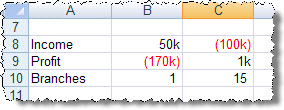
The idea is to create a chart based on a set of figures which incorporate a variable. The variable is in a cell that is controlled by one of Excel's interactive controls - in this case a scroll bar. As the scroll bar value is changed, the value in the cell is changed and the chart data, and of course the chart itself, changes accordingly. The data has been kept very simple in order to concentrate on the techniques involved. Here is our data:
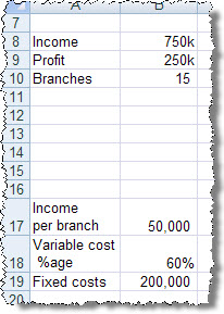
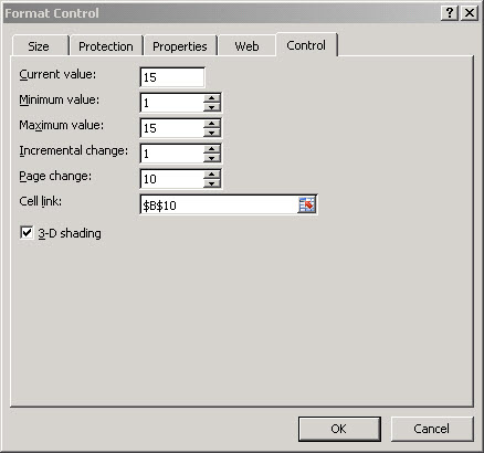
The variable we will be changing is held in B10 - the number of branches we intend to open for our organisation. To include our interactive slider we choose View, Toolbars, Forms to display the forms toolbar (Excel 2007: Developer ribbon, Controls group, Insert, Form Controls) , then click on the scroll bar tool and drag a horizontal rectangle under the area where our chart will be created. Then right-click on the scroll bar control and choose 'Format Control'. Here we can set our maximum and minimum values, the incremental change and, very importantly, the 'Cell link' which in our case is our branches cell: B10:
If we now click outside of our control and then click the scroll bar 'decrease' arrow we should see the number of branches reduce.
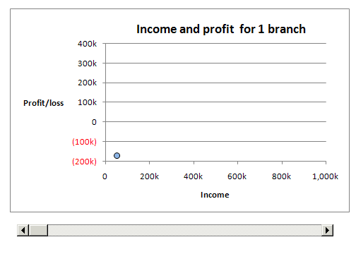
We can now set up our chart using the Chart wizard in Excel 2003 and before, or the Insert, Chart ribbon group in Excel 2007. We've used a bubble chart in our example and formatted both horizontal and vertical scales to fix the maximum and minimum values so that they don't keep changing as we generate different sets of results. If we based our chart solely on the labels and values in A8 to B10, then the size of our bubble wouldn't change as it's based on the relationship between the biggest bubble and an automatic default, and we only have one bubble. To allow the bubble to increase in proportion to the number of branches, we've added some additional values to be included in our chart source data:
The branches figure in column C is designed to be set to the maximum possible number of branches. This bubble will always be displayed, and so the 'real' bubble will be a proportion of its size. We don't want to see the maximum bubble so, since we've fixed the scales, we just set the income figure to a number that won't be shown on our chart. The Profit figure just needs to be not zero. This technique of adding additional series of data to achieve certain chart effects was covered by Andy Pope at the Excel User conference, and his website includes dozens of brilliant ideas for adapting Excel charts: http://www.andypope.info/charts.htm
Finally we have set the chart title to automatically adjust to the number of branches selected. This is done by clicking in the existing text title and then clicking on a cell containing a formula that produces the required text:
="Income and profit for " & B10 & " branch" & IF(B10>1,"es","")
Note the use of the IF() function to add the 'es' on to the end if there is more than one branch.
Design by Reading Room Ltd 1998